Counting Coins
I have a habit of counting coins. Whenever I get spare change I keep it in a jar until it fills up – which typically takes about a year and a half. I’ll then dump them out and break them into groups by type; pennies, nickles, dimes etc. Then further sort them by the date of manufacture. By doing this I’ve managed to find some very interesting old coins, but I also kept a detailed record of the counts per decade. Lately I’ve been wondering what I could infer about the circulation of coins from just my limited sample.
To do this, I needed some data on how many coins were produced by the U.S Mint. Luckily, Wikipedia has a compiled a page with exactly this data: [https://en.wikipedia.org/wiki/United_States_Mint_coin_production]. I cleaned this data up a bit and plotted it out.
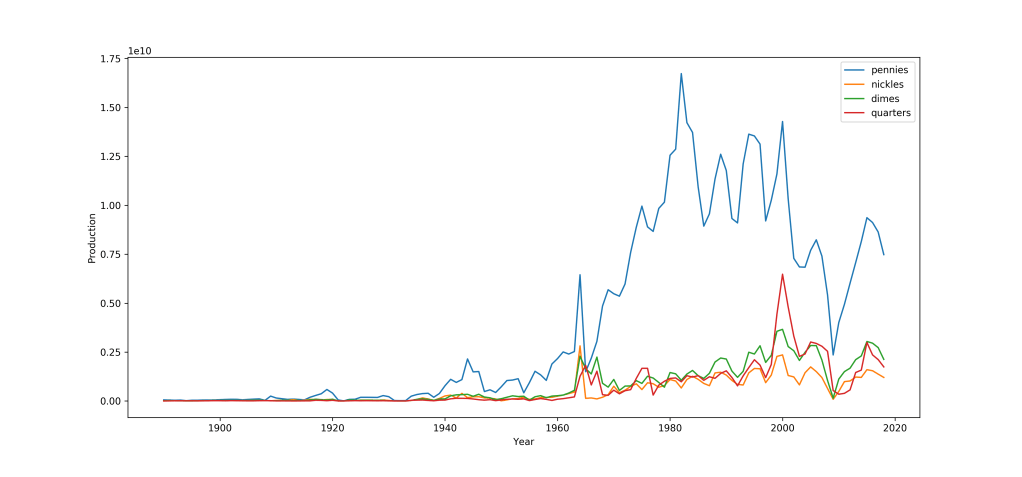
There’s a couple of things that jump out immediately. We can see a huge downturn in coin production in the year 2009 – which I assume was influenced by the 2008 recession. There are also far more pennies are produced than any other coin, especially in that huge spike around 1985. While I’m sure a lot of interesting insights can be gained from data this detailed, unfortunately I only recorded the distribution of my coins with the precision of a decade. So I’ll have to bin this down a bit.
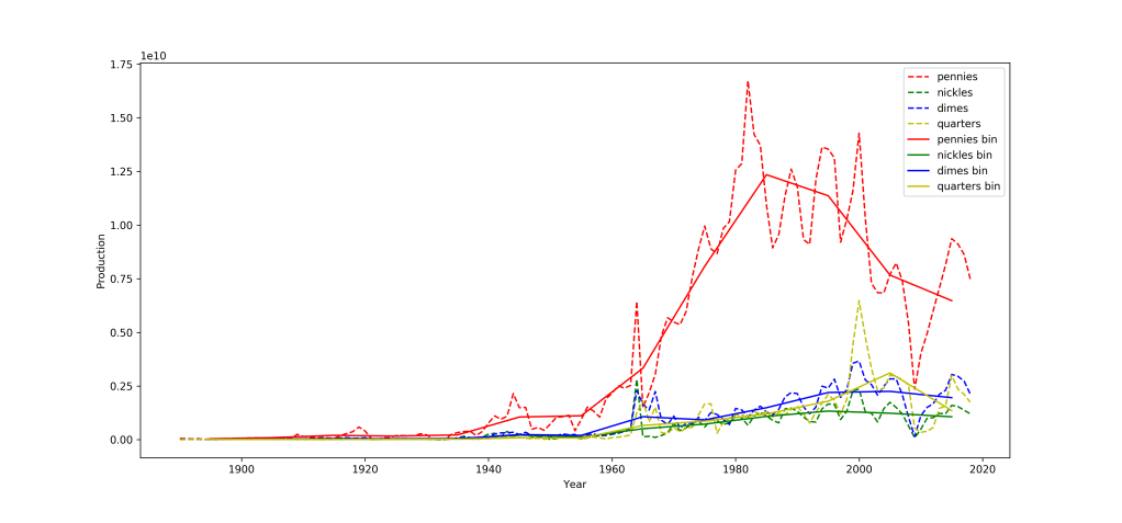
Here’s the same plot as before but showing the yearly data in dashed line and the binned data (centered on the middle of each decade) in solid lines. On the decade scale a lot of the year-to-year volatility gets averaged away, and its easier to see the overall behavior. Now for my samples!
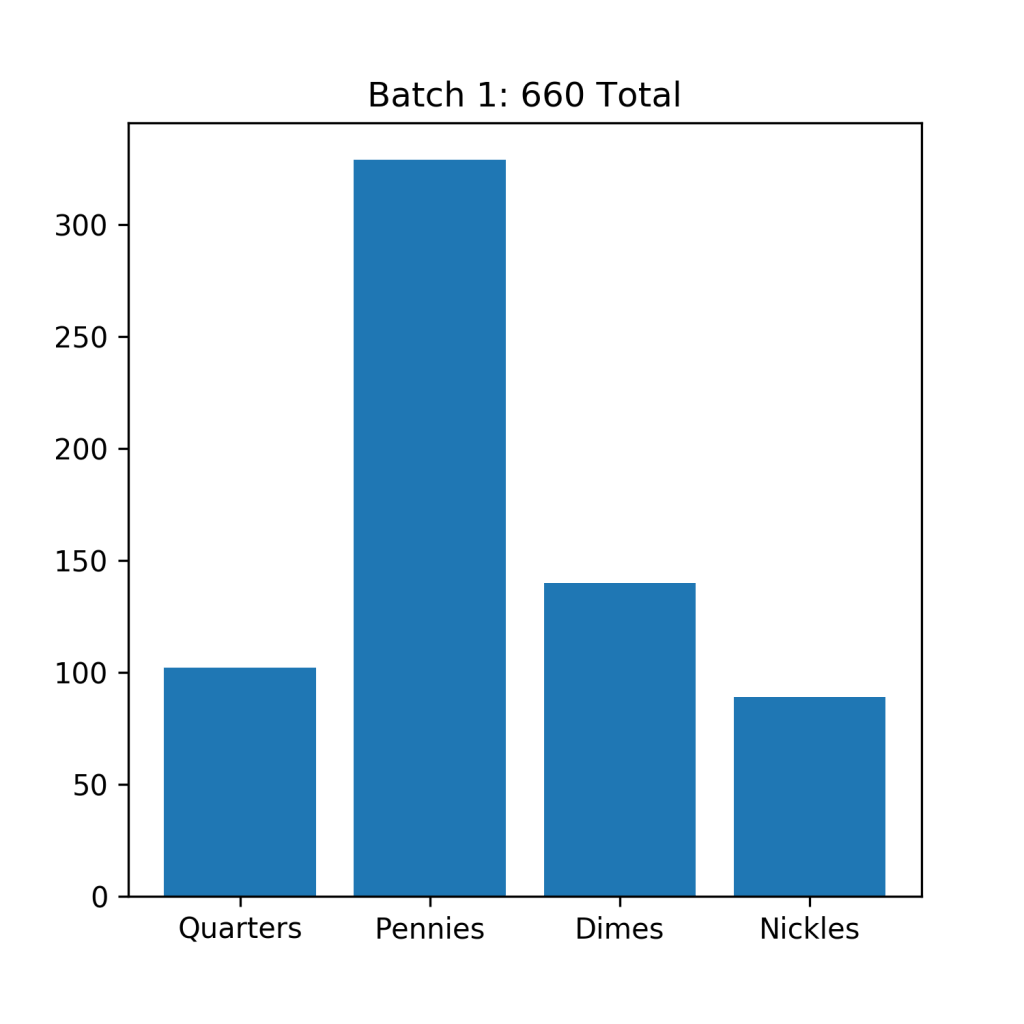
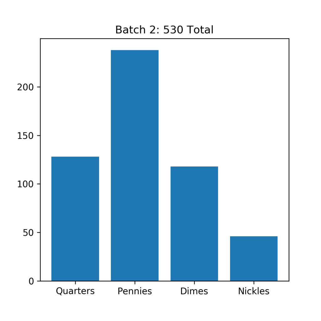
Since I’ve only been keeping track of my coins for a few years, I’ve only had to empty my jar twice (It takes a long time to save up several hundred coins!). But I end up with a respectable 660 coins in my first batch – which I counted a few years ago, and another 530 coins in my most recent batch. This ends up being a total of 1190 total coins, not a bad sample size!
The first thing I wanted to do is compare the distribution of coins as a function of decade with production for each batch. To do this I normalized the production data and the data from each batch independently and plotted them.
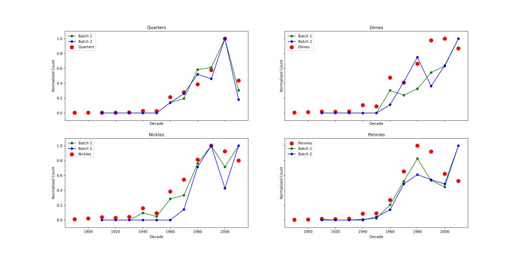
This plot shows a few interesting features. First of all the distribution in each batch of quarters closely matches US Mint production! Pennies also match fairly well, but I seem to be missing quite a few 1980s and 1990s pennies. Dimes and Nickles seem to echo the overall trend of production – younger coins are more common, but they don’t particularly resemble the production values. To make a more quantitative statement about the agreement I’d need to say something about the error associated with the relative abundance of each quantity. In essence I want to ask if I draw a certain number of coins from the above distributions, how closely do I expect the measured relative abundances to match the true relative abundances?
Rather than try to slog through the mathematics of the situation, I thought it would be easier to calculate the errors by simulation. Instead of considering the above complicated situation I started with a simpler problem.
Consider a bag with many colored balls. You know before hand that 3/6 of the balls in the bag are red, 2/6 are blue and 1/6 are green. That is, the balls in the bag have a 1: 2/3: 1/3 ratio (for every 1 red ball, there are 2/3 blue balls and 1/3 green ball). Lets say I draw 10 balls from the bag. I end up getting 5 red balls, 3 blue balls and 1 green ball and calculate a 1: 0.6: 0.2 ratio. In order to figure out how confident I am that my derived ratio reflects the true one, I’ll simply conduct the experiment 100s of times and calculate the ratios in each case. Then I’ll assert my 95% confidence bounds are just the 95th percentile bounds of the resulting distributions of relative abundances. Running 1000 simulations of this approach, with 200 draws each produces the following result.
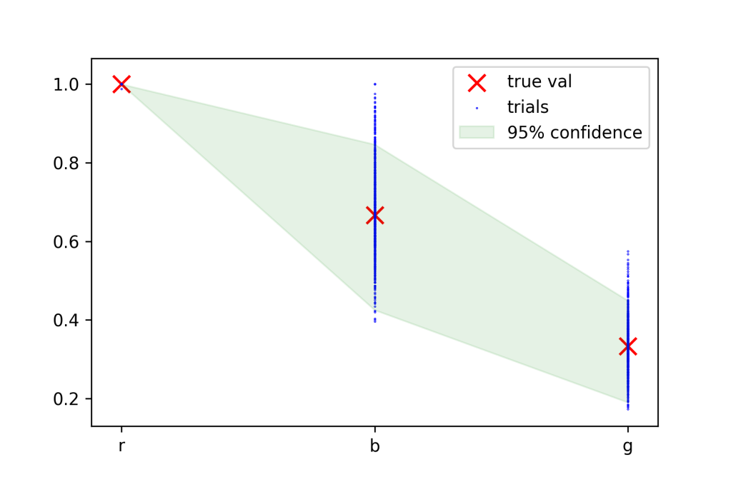
Here the true values are in red, and the abundances calculated in each trial are the blue points. The green area is the area in which 95% of the blue points fall. A few interesting things jump out. First, the error in the relative abundance of the red ball is very low compared to the green and blue balls. This is due to the fact that calculating a relative abundance involves dividing by the most abundant feature. The only way red balls wouldn’t have a relative abundance of 1 is if we had more picked more blue or green balls out of 200 draws – something that is extremely unlikely. The second observation is that the error in the abundance of green balls is much smaller than that on blue balls. This also makes some sense. Imagine if the probability of the green ball was super small, say 0.001 instead 1/6. Whether you happened to draw a green ball or not makes little difference in the overall picture, you could still surmise that green balls must be very rare relative to the others. As a general rule, balls with similar probabilities will tend to increase your errors, whereas balls with widely spaced probabilities will tend to decrease it.
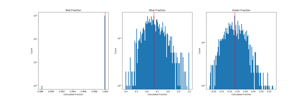
We can also look at the histograms of the actual abundances from the experiment. Plotted in both log and linear scale. The log scale representation is useful to see the few times red balls were not the most probable outcome (look at the one draw at 0.988!). The linear scale plot shows that the distributions of don’t seem to be horribly multi-modal or anything. So just using a percentile bound is probably reasonable here. Next step is to try the same approach on the coins!
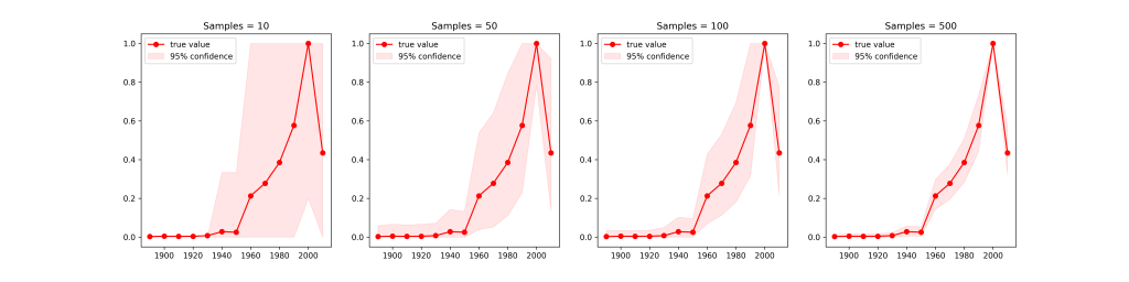
Here I ran the same simulation 10000 times for the distribution of quarters, each time with a different number of draws. We can see the same general trends. The error-bars decrease with a larger number of samples & points with very similar abundances have larger error bars. Something interesting happens in the tail of the distribution with extremely low number of samples. With very few samples it’s almost impossible to randomly draw a pre-1930s quarter, so the error bars are tiny. Once you draw enough points to detect them, the error bars balloon – then shrink down again as you get enough samples to properly quantify their abundance.
The last thing to do is apply it to all of the coins. Rather than plot the two batches separately I’ve combined them to get the best signal to noise-possible. This seems reasonable since our earlier plots showed that neither sample seemed horribly biased.
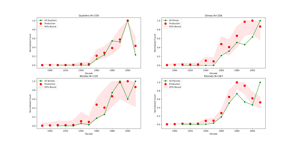
We can see that for Quarters and Nickles my counts are consistent with the Mint production data, the disagreement we saw earlier with Nickles seems to be a aspect of the small overall sample size. The pennies and dimes are more interesting. The pennies show the uptick in production frequency near the 1980s, but it’s not nearly as large as it should be – a similar effect seems to be occurring in the dimes as well. Also of interest is the last entry for the 2010s pennies is much larger than it should be. If anything I’d have expected this to be smaller, since my sample is incomplete for that decade (it’s tough to come across a 2019 penny if you’re counting coins in 2016).
I’m not totally sure what’s driving these effects, but I had a lot of fun working on this. I put both the code and the data used to generate these figures on Github, should anyone else want to play around with this.
Github Link to Code: https://github.com/r-zachary-murray/archive/tree/master/Coin_Counting
